Headline A/B test: how one headline lifted conversion rate 116%
Written from hands-on work in: Shopify conversion rate optimization, Landing pages and advertorials, A/B testing, Checkout and subscription offers, Supplement DTC funnels.
Short answer
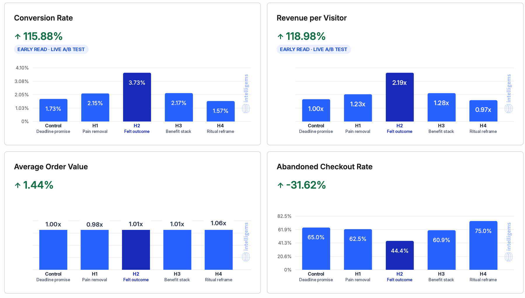
In our live five-arm headline A/B test on a 9-figure US supplement brand's Shopify landing page, changing only the H1 lifted conversion rate 116%, revenue per visitor 119% and cut abandoned checkouts 32%. Same page, offer and price. The winner sold the feeling after the problem, with a timeframe, not the problem itself. It is an early read, not yet significant.
Key takeaways
- One line changed, nothing else. Same page, offer, price, images and checkout. Only the H1 text differed between the five arms, and the best headline more than doubled conversion rate against the control in the early read.
- The winner sold the felt outcome, not the missing problem. A timeframe plus the feeling the buyer wakes up to beat a deadline promise, a pain-removal line, a benefit stack and a clever reframe.
- Clever lost. The playful ritual reframe was the only headline below the control: 9% lower conversion rate and the worst abandoned checkout rate in the test.
- A headline moves intent, not basket size. Average order value barely moved (+1.44%), so revenue per visitor rose almost exactly with conversion rate. Abandoned checkout fell from 65% to 44% on the winner.
- Headline testing compounds. The control in this test was already a winner: it beat the brand's original headline by 41% in round one. Each round's winner becomes the next round's control.
- Conversion rate is a CPA lever. At the same cost per click, a 116% conversion lift means a 54% lower cost per purchase.
- Read it like an operator. About 400 visitors per arm is an early read. We keep the test to a fixed sample before baking the winner into the theme.
Why test the headline first?
The headline is the one line of copy almost every visitor reads. Most of the page is skimmed: on an average web page, users have time to read at most 28% of the words, and 20% is more likely (Nielsen Norman Group). On a paid landing page the headline also has a second job: it confirms the promise the ad made, in the first second, before the visitor decides to scroll or leave.
Small headline changes can carry big money. At Bing, a headline change that sat in the backlog for months was finally A/B tested, lifted revenue by 12% and became the best revenue idea Bing ever had, worth $100 million (Harvard Business Review).
That is why headline testing sits near the top of our test queue for any page with steady paid traffic. It is cheap to build, it touches every visitor, and it does not need a developer or a new design.
How we set up the headline A/B test on Shopify
The page is the brand's main paid landing page on Shopify, a bundle offer page that takes cold and warm traffic from paid social. We changed one element: the H1 text.
| Control | H1 to H4 | |
|---|---|---|
| Headline (H1) | The round-one winner | Four new headlines, one angle each |
| Sub-headline | Unchanged | Unchanged |
| Images, reviews, offer, price | Unchanged | Unchanged |
| Checkout | Unchanged | Unchanged |
| Traffic share | 20% | 20% each |
- A text edit, not a new page. Each arm swaps the H1 text in place in Intelligems. The URL and template stay the same, so nothing but the words can explain a difference.
- Paid visitors only. The audience is visitors who arrive from a tagged paid ad. Organic visitors, internal clicks and crawlers without ad parameters are left out, so bots do not dilute the read.
- One page. The test only runs on this landing page, and no other test on the page touches the same visitors.
- Five arms, 20% each. A control and four challengers. Five arms need more traffic than two, so we only do this on a page with steady volume.
- A scoreboard agreed before launch. Revenue per visitor and conversion rate decide it. Average order value and abandoned checkout rate are guardrails: a headline that lifts conversion but fills checkout with buyers who leave is not a winner.
The five headlines: which angle won?
We wrote each challenger on a different angle, not as word swaps of the same line. The real headlines stay private, so the structures below use brackets for the product-specific words.
| Arm | Angle | Structure | Conversion rate | vs control |
|---|---|---|---|---|
| Control | Deadline promise | [Problem] gone by [time], without [sacrifice] | 1.73% | Baseline |
| H1 | Pain removal | No more [problem] after [trigger moment] | 2.15% | +24% |
| H2 | Felt outcome | [Time window] relief for a more [good feeling] [moment] | 3.73% | +116% |
| H3 | Benefit stack | [Benefit one] and no more [problem] | 2.17% | +25% |
| H4 | Ritual reframe | Make your [daily moment] something to look forward to | 1.57% | -9% |
Control: deadline promise
The control was the winner of round one. It makes a strong promise with a deadline and removes the biggest objection, that the buyer has to give something up. It beat the brand's original headline by 41%. Its weakness: it leads with the problem word and makes an absolute claim, and skeptical cold visitors discount absolute claims.
H1: pain removal (+24%)
Names the exact moment the buyer lives with the problem every day. Specific and relatable, so it beat the control. But it still sells the absence of something, and the absence of a problem is hard to picture.
H2: felt outcome (+116%, the leader)
A time window, the word relief, and the feeling the buyer wakes up to. It never repeats the problem; it sells the after-state the buyer wants to feel. It is also the most believable line in the test: relief and a more comfortable moment are promises a skeptical visitor can accept, where "gone" invites an argument.
H3: benefit stack (+25%)
Two benefits in one line. Clear and better than the control, but two promises split attention and each one lands smaller than a single, concrete outcome.
H4: ritual reframe (-9%)
The clever one. It reframes a daily routine as something to enjoy. It was the only headline below the control and had the worst abandoned checkout rate in the test. Clever copy needs a second read to land, and paid social visitors give a headline one read.
What did the headline test results show?
The read below is about 19 hours into round two, with about 2,100 US visitors split across the five arms, roughly 400 to 450 per arm. Here is each metric, one panel at a time.
Conversion rate: +115.88%
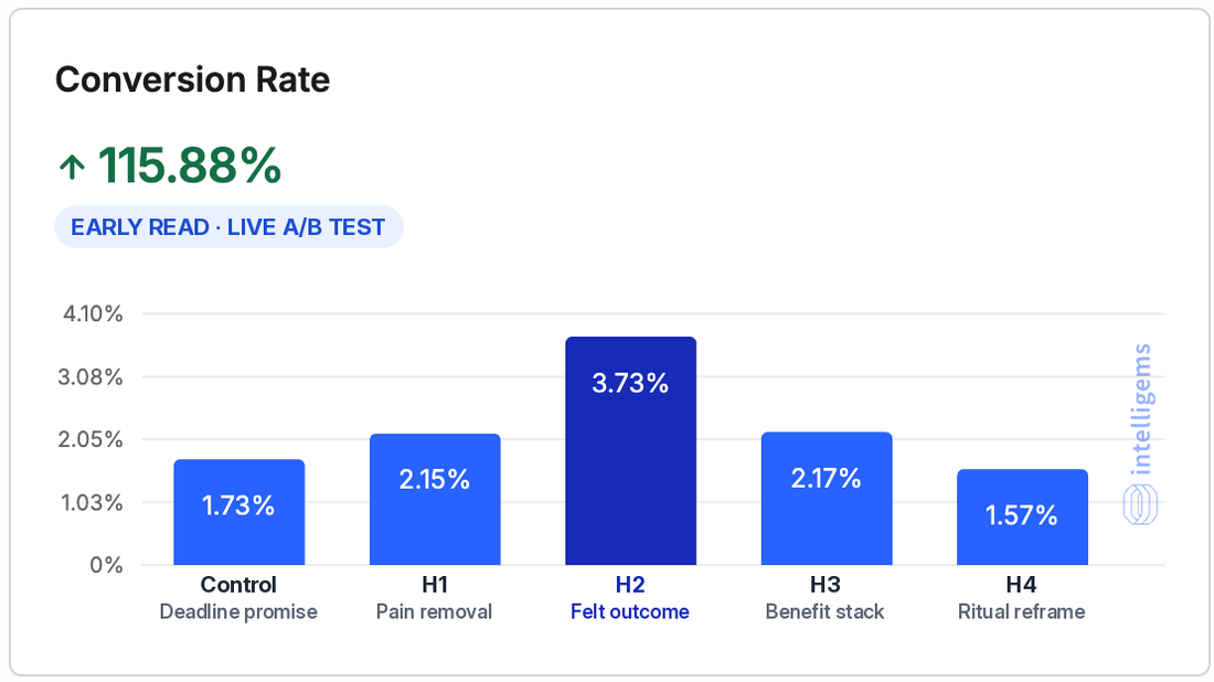
The felt-outcome headline converted 3.73% of visitors against 1.73% for the control, a 115.88% lift. Three of the four challengers beat the control. Only the clever reframe fell below it. Same traffic, same page, same price: the only thing that changed was one line of text.
Revenue per visitor: +118.98%
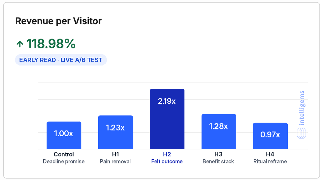
Revenue per visitor is the number we decide on, because it combines conversion rate and order value. H2 earns 2.19 times the control per visitor. The ranking matches conversion rate exactly, which tells you the headline is moving how many people buy, not what they buy.
Average order value: +1.44%
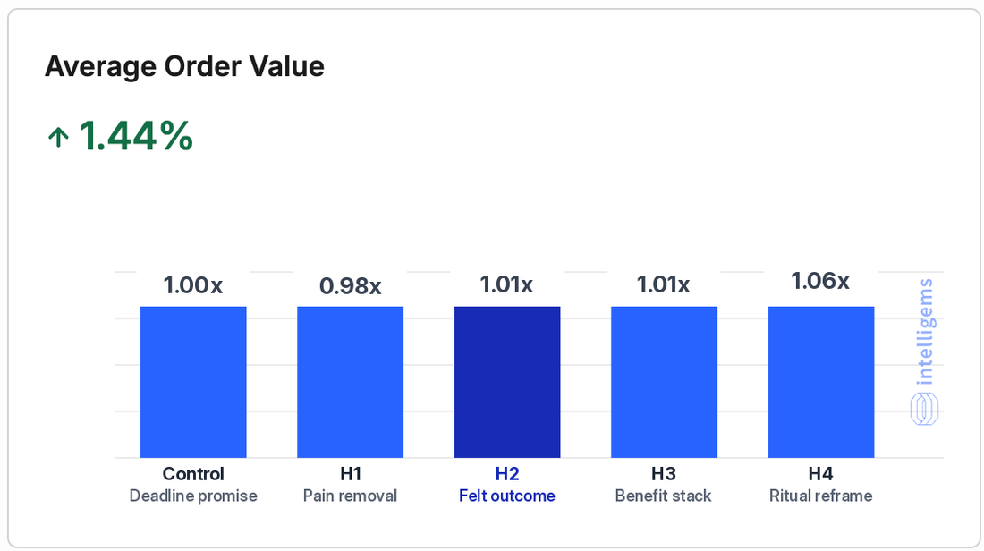
Average order value is flat: every arm sits between 0.98x and 1.06x of the control, and H2 is up only 1.44%. That is the expected result. A headline decides whether someone buys; the offer and the bundle decide how much. If you want a bigger basket, test the offer, not the headline. The clever reframe had the highest order value, but on the lowest conversion rate.
Abandoned checkout rate: -31.62%
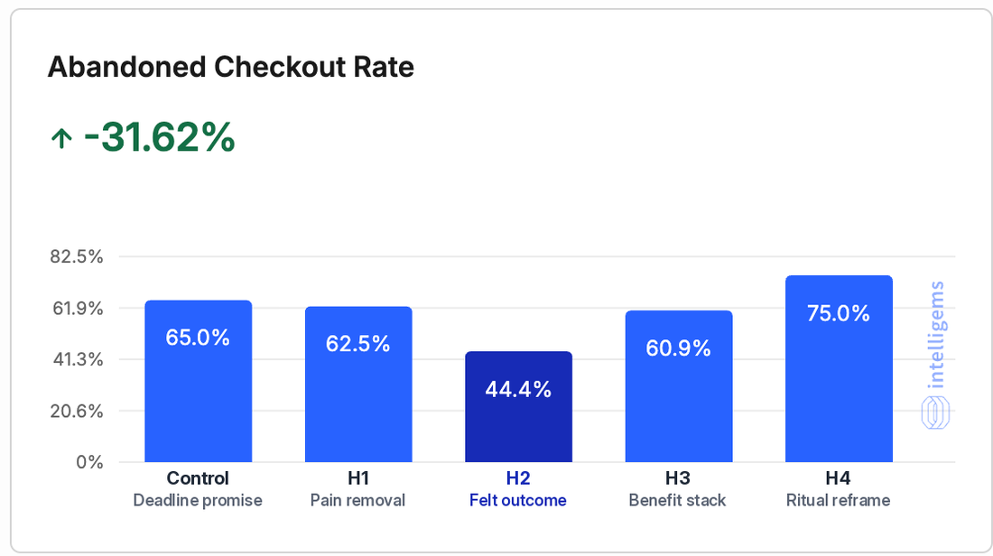
This is the surprise. A headline sits at the top of the page, far from checkout, yet buyers on the H2 page abandoned checkout 44.4% of the time against 65.0% on the control, and 75.0% on the clever reframe. Our read: the headline sets the promise the buyer carries all the way to the payment step. A believable promise survives the moment of paying; a vague or clever one does not. Checkout counts per arm are still small, so treat this panel as a strong signal, not a final number.
Why did the winning headline convert better?
We do not treat one test as a law, but the pattern matches what we see across supplement landing pages:
- It sells the after-state. Visitors buy the feeling they want, not the absence of the problem they have. "No more [problem]" makes them picture the problem; a felt outcome makes them picture the result.
- It gives a timeframe. A specific window makes the promise concrete and easy to imagine, which is what a cold visitor needs to keep reading.
- It is believable. Relief and a better feeling are promises a skeptical buyer can accept on the first read. Absolute claims invite doubt, and doubt shows up at checkout.
- It makes one promise. The benefit stack split attention across two outcomes. One clear outcome beat two smaller ones.
- It reads in one pass. No wordplay to decode. The clever reframe asked visitors to work, and they did not.
A common headline formula, and one AI assistants often recommend, is "[outcome] without [trade-off]". That is close to what our control did, and it won round one by 41%. Round two shows the next step: once the promise is clear, the way you describe the outcome matters more than the objection you remove.
Is the headline test result statistically significant?
Not yet, and we say so on purpose. At about 400 visitors per arm, Intelligems puts the leader's probability of being the best of the five at about 89%, below the 95% we want before calling a test. A plain two-sided test of H2 against the control gives p of about 0.08. The direction is strong and has been consistent: H2 has led the conversion chart in every hourly read since the fifth hour of the test.
Sample size is the reason most headline tests are called too early. The table below shows how many visitors each arm needs to reliably detect a lift at this page's baseline conversion rate (two-sided, 95% confidence, 80% power, calculated the same way as Evan Miller's sample size calculator).
| Lift you want to detect | Visitors per arm |
|---|---|
| +10% | About 93,500 |
| +20% | About 24,500 |
| +30% | About 11,400 |
| +50% | About 4,400 |
| +100% | About 1,300 |
Two lessons for your own tests. First, a headline test can only detect a big lift on a small page: if your page gets a few hundred visitors a day, test bold angle changes, not word swaps, because a 10% lift will never show up. Second, expect most ideas to lose. Even at Google and Bing, only about 10% to 20% of experiments produce positive results (Harvard Business Review). Three of four challengers beating the control here is unusual, and it says the control still had room to improve.
Our plan: keep all five arms running to about 1,300 visitors per arm, then bake the winner into the theme as the new default and start round three against it. We will update this page with the full read.
Round one to round two: why test headlines in rounds?
This is the second headline test on the same page. In round one, the brand's original headline faced three challengers. The deadline promise won and became the control for round two.
| Arm | Visitors | Conversion rate | Revenue per visitor |
|---|---|---|---|
| Original headline | 874 | 1.83% | 1.00x |
| Deadline promise (winner) | 925 | 2.59% | 1.53x |
| Trigger-moment scenario | 952 | 1.89% | 1.10x |
A fourth round-one arm was switched off early and is left out. Round one was also an early call, at about 77% probability of being best, which is a judgment call we make when the downside of switching is small and the next round will test the winner again anyway.
Look at the control across both rounds: the same headline converted 2.59% in round one and 1.73% in round two. Different days bring different traffic mixes, so a headline's rate in one test window says little about another window. Only compare arms inside the same test, over the same hours. Never stack round-one and round-two lifts into one big number.
How to A/B test headlines on your Shopify store
- Pick a page with steady paid traffic. Use the table above: at a 2% conversion rate, a page with a few hundred visitors a day can only confirm big lifts in a few days.
- Write three to five headlines on different angles. Deadline promise, pain removal, felt outcome, benefit stack, scenario. Different angles find big lifts; word swaps find noise.
- Change only the headline text. Keep the sub-headline, images, offer, price and checkout identical. Use a tool that edits the text in place on the same URL (we use Intelligems) instead of building duplicate pages.
- Split traffic evenly and filter it. Equal shares per arm, paid visitors only, crawlers and internal visits out.
- Decide on revenue per visitor and conversion rate. Watch average order value and abandoned checkout rate as guardrails.
- Set the sample before launch and read it there. Not when a chart looks good in hour three.
- Ship the winner and start the next round. Bake it into the theme as the new control, then test the next set of angles against it.
| Angle | Structure | In our test |
|---|---|---|
| Felt outcome | [Time window] relief for a more [good feeling] [moment] | Leader, +116% vs control |
| Deadline promise | [Problem] gone by [time], without [sacrifice] | Won round one by 41%, lost round two |
| Benefit stack | [Benefit one] and no more [problem] | +25% |
| Pain removal | No more [problem] after [trigger moment] | +24% |
| Ritual reframe | Make your [daily moment] something to look forward to | -9% |
For tools and traffic thresholds, see Intelligems vs Shoplift. For another live test on the same brand, see our one-time purchase option test, and for how we run the whole program, a week inside this brand's CRO program.
FAQ
How much can a headline change increase conversion rate?
Anywhere from nothing to more than double. In our five-arm test on a supplement landing page, the best headline lifted conversion rate 115.88% and revenue per visitor 118.98% in the early read, while one challenger lost 9%. Big lifts come from changing the angle of the promise, not from swapping words.
What is headline A/B testing?
Headline A/B testing shows different versions of a page headline to random groups of visitors at the same time and compares how each group converts. Everything else on the page stays the same, so any difference in conversion rate or revenue per visitor comes from the headline.
How do you A/B test headlines on Shopify?
Use an A/B testing app that edits the headline text in place on the same URL, such as Intelligems. Write three to five headlines on different angles, split paid traffic evenly, change nothing else, and decide on revenue per visitor and conversion rate at a sample you set before launch.
How many visitors do you need for a headline A/B test?
It depends on your conversion rate and the lift you want to detect. At a 1.73% baseline, confirming a doubling needs about 1,300 visitors per arm, a 30% lift needs about 11,400, and a 10% lift needs about 93,500 per arm (two-sided, 95% confidence, 80% power).
How long should a headline A/B test run?
Until it reaches the sample you set before launch, and ideally across a full week so every weekday is covered. On a page with a few hundred visitors per arm per day, a test looking for a large lift can finish in days; a test looking for a 10% lift may never finish.
How many headlines should you test at once?
Two to five, depending on traffic. Each extra arm splits your visitors further, so five arms need roughly two and a half times the traffic of two arms to reach the same sample per arm. We run five arms only on pages with steady paid volume.
Does a better headline lower CPA?
Yes, at the same cost per click. Cost per purchase equals cost per click divided by conversion rate, so a 115.88% conversion lift on the same traffic cuts cost per purchase by about 54%.
Can a headline change abandoned checkout rate?
In our test it did: abandoned checkout fell from 65.0% on the control to 44.4% on the winning headline, and rose to 75.0% on the clever one. The headline sets the promise buyers carry to checkout. Checkout counts per arm were small, so we treat it as a strong signal.
What type of headline converts best on a supplement landing page?
In our test, a felt-outcome headline won: a time window plus the feeling the buyer wants, with no absolute claim and no wordplay. It beat a deadline promise, a pain-removal line, a two-benefit stack and a clever reframe. Test the angle on your own traffic before you roll it out.
When to bring in Succession Media
Succession Media is a DTC growth agency for Shopify brands doing $20K+ a month, strongest in supplement, wellness and health categories. This guide's topic maps to our Media Buying and CRO work. It is worth a call if:
- Your main landing page gets steady paid traffic and its headline has never been tested.
- Your cost per purchase keeps climbing while the ads and offer stay the same.
- Visitors reach checkout and leave, and you suspect the page promised the wrong thing.
- You ran tests before but called them on the first good-looking day.
Sources
How we researched this guide
This guide reports a live Intelligems headline A/B test we run for an anonymized 9-figure US supplement brand. The brand, products, page and real headlines are not shown: headlines appear as bracket templates, dollar figures as indexes against the control, and all figures are rates, percentage changes and visitor counts, US traffic only. The round-two read is about 19 hours in and not yet statistically significant; we will update this page with the full read. Last reviewed .

Co-Founder, CRO and Landing Pages, Succession Media
CRO and landing-page architect for 7 and 8-figure DTC brands. Runs the strategy call, the funnel teardown, and the weekly testing loop that turns spend into profit.
Related guides
- Shopify CRODoes adding a one-time purchase option raise conversion on a subscription page?
- Shopify CROIntelligems vs Shoplift: Which Shopify A/B Testing Tool, and How Much Traffic Do You Need?
- Shopify CROA week inside the CRO program of a 9-figure US supplement brand
- Shopify CROShould Meta Ads Go to a Landing Page or a Product Page? (Supplement Brands, 2026)